O.C.Tanner · Design & Experimentation
O.C.Tanner faced a problem during it's sales process. Clients were asking for sandbox environments instead of sales team-led guided walkthroughs. We researched where users went during these explorations and made plans to improve the most visited areas. The company store, where employees could redeem points for products, was the third most visited page but the least inspiring. User data also showed that organic engagement with page content only consummed 6% of clicks. Users were using the search bar to find what brands were available in the store.
With this information we set the goal to improve content comprehension and increase user engagement with the company store.
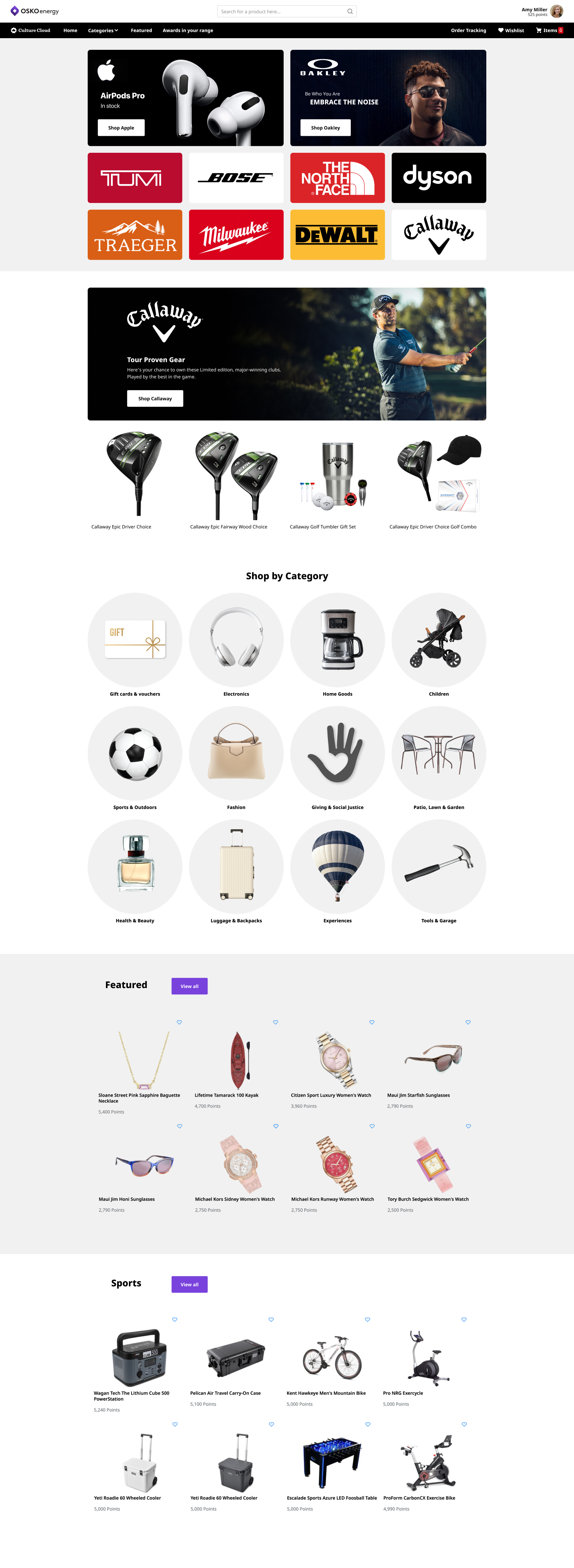
Highlighting name brands at the top of the page instead of listing specific products solved the biggest problems we found in our research. It gave visitors a clear idea of what they would find in our store.
For corporate clients during a demo this section gave a quick indicator that our store was filled with popular and recognizable brands. Demos rarely went further into the store than the homepage, so this design change gave the sales engineers an easy visual aid when pitching the store.
For store users the new brand highlights gave users a clickable path into brands they knew and could be excited about. This was the biggest factor in increasing the content engagement from 6% to 37%, and reduced searching for brands in the store header.
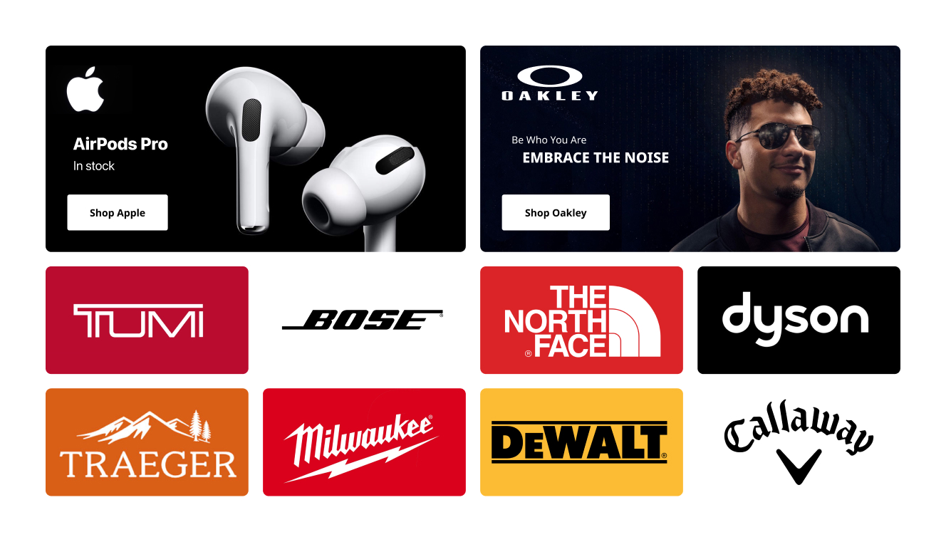
I designed specific sections that would highlihgt brands generally and specific offerings from that brand. These sections served two purposes; they allowed us to highlight a recognizable brand (similar to our brand tiles), and created an opportunity to sell homepage space to vendors who wanted their wares highlighted.
Our merchandizing team estimated ~$550k in annual revenue from selling these spaces.
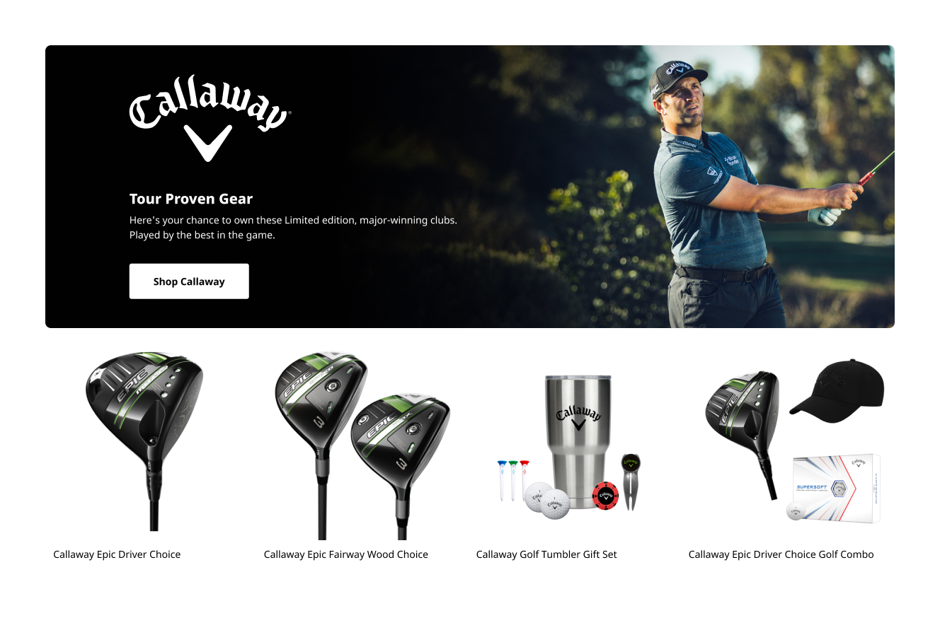
To round out the homepage, I added category images without any brand-specific labelling or imagery. This section allowed us to highlight the breadth of offerings beyond the brands called out at the top of the page.
The original design highlighted several categories of human selected products with a mere 6% of users clicking on any of the page content.
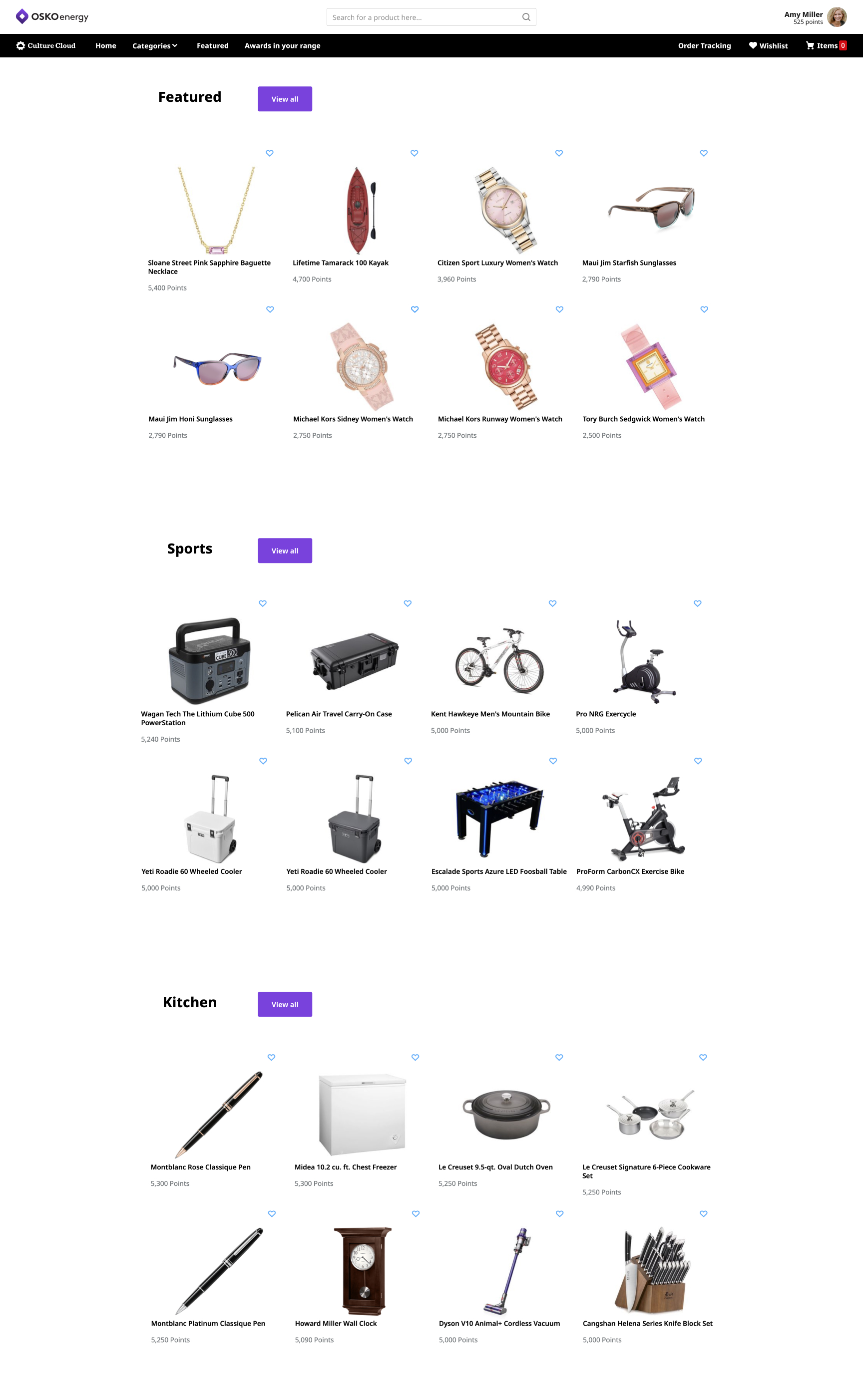
The redesign shifted focus from specific products to recognizable brands and categories. Page engagement jumped to 37%.